
About a five minute read
It might not surprise you, that as a provider of a super simple and easy-to-use elearning authoring tool and Learning Management System (LMS) that allows you to create responsive elearning courses, we love responsive elearning! We want to share the love, so here are our top 5 reasons that responsive elearning is just better.
What is responsive elearning?
Before we go into why responsive elearning is better than the alternatives, just exactly what is responsive elearning and what are the alternatives?
Responsive elearning is any elearning course that changes its display based on the size and type of screen that it’s being displayed on. That means it works on all devices, such as desktops, laptops, tablets, and mobiles by fitting the content to the screen.
Before responsive elearning came into the mainstream, most elearning was created specifically for desktop use. This means if you tried to use it on a different device such as a tablet, the content might not work at all, or wouldn’t fit the screen size properly and became much less engaging for the learner.
The other alternative to responsive design that is becoming popular is mobile elearning, also known as ‘mlearning’, which is designed for use on mobile devices above all other devices. Although this can create some elearning that is great for specific use cases, such as when learners don’t have access to a computer, the vast majority of formal training is still done by employees in offices or working from home on a computer. You can potentially leave this large cohort of learners out in the cold by creating elearning designed only for mobile devices.
So, now we’ve got that covered, let’s get into our top reasons why responsive elearning is just better.
1. Access at any time on any device

By making your elearning responsive, you’re able to make sure that regardless of the type of device being used to access your elearning, your learners still get the best possible experience.
Your learners will be able to carry out their training from their office computer, while working from home, via mobile during their commute, or at home if they would like to spend their time upskilling.
This helps to ensure that your entire learning audience, whether office or field-based, has equal access to the training you’re making for them. It can help reach those learners who don’t have access to a computer in the normal course of undertaking their job role.
2. User-friendliness

User-friendliness and the learning experience are key in ensuring your elearning does its job properly. Responsive elearning ensures that your content not only fits the screen on any device, instead it also helps people to navigate content in the way they would expect to on a device – for example swiping on a mobile or clicking a next button on a desktop.
If you’ve ever created an elearning course for a tablet or mobile device, you may have noticed that the user interface has to be different. This is because the user interface on a tablet and a mobile device are different, and the user expects to navigate through the content differently too.
3. It increases engagement and completion rates

By allowing your learners to access their learning from any device at a time convenient for them, it helps keep your audience engaged, which leads to higher completion rates and better learning outcomes.
Creating elearning that looks as if it was designed for the device makes the content feel much more like other types of content they might be consuming on a daily basis through social media and streaming platforms. By mimicking the look and feel of those types of content with responsive elearning, you get the same benefits, such as increased time spent on the learning and higher engagement with the material.
4. It’s cheaper to make and deliver
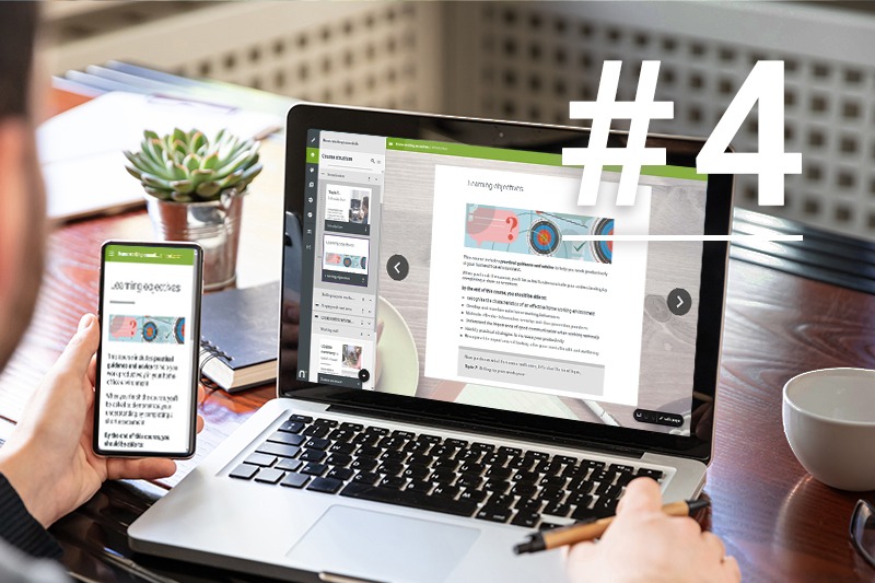
It’s fairly well known that elearning is a much more cost effective alternative to traditional face-to-face training, but responsive elearning goes one step further. Once you’ve made the decision to create a course as a piece of elearning, using an authoring tool that lets you create responsive elearning is also less expensive than having to create many versions of the same course for different screen sizes and device types.
Cutting down on the cost of actually creating your elearning helps speed up production, and when used in tandem with an LMS such as Nimble LMS to deliver it, it helps you make great financial savings in terms of getting your training out to your learners quickly.
5. Future-proof
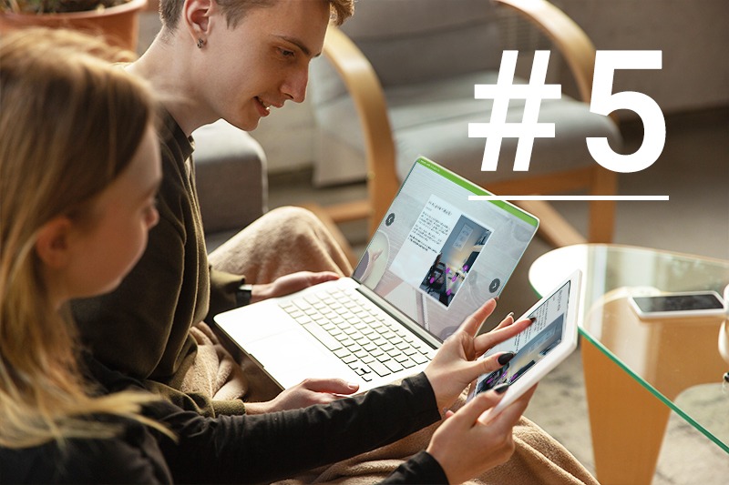
Whilst the majority of elearning is still done on computers, the move towards having employees complete training – both formal and informal, on mobiles and tablets is increasing all the time.
Creating elearning that’s responsive and can suit whatever devices your learners may be using in the future helps you ensure that you won’t have to continually update your elearning to suit new device types, as your responsive courses will respond to their screen sizes automatically.
If you’re looking to create engaging responsive elearning in a super-simple and easy-to-learn way, then our authoring tool Nimble Author might just be the perfect tool for you.
Nimble is a provider of elearning tools and courses that make it super simple to deliver engaging learning to your employees quickly and easily.

0 Comments