When you’re designing an elearning course, sometimes images can be a bit of an afterthought, but the pictures you select – and the way you use them – can have a surprising effect on the training’s potential. Read on to find our top tips for using images to maximise the impact of your elearning. As always, we’ve done the research, so rest assured that these strategies are backed up by learning science.
1: Choose photographs
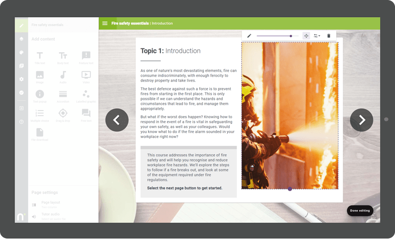
Photographs are generally a better choice than clip art style images; people relate to other people, and they give a more modern look (and if you’re on a budget and need some high-quality images, check out our favourite free resources for building elearning). Of course, there are times when an illustration or diagram can get the point across more effectively, but well-chosen photos are engaging and relevant – helping to keep your learners interested and motivated.
2: Use them wisely!
Think carefully about what purpose images are serving. It’s usually a good idea to break up walls of text, but most of the time, one large image per page is just perfect. Resist the temptation to fill the pages of your course with images that aren’t useful. This could actually have a negative impact on learning (Thalheimer, 2004). Also think carefully about the placement of your images. Try to make the page easy to read (and don’t forget to consider how it might appear on a tablet or phone screen – something you can check easily in Nimble Author). One tip we often suggest at Nimble is to use a two-column layout, with an image on one side and text on the other, keeping each column a similar length. It’s easy on the eye, and sticking to a consistent layout reduces frustration for learners.

3: Crop and zoom
Full-scale photo editing might not be in your skillset, but it’s worth taking a few simple steps to make the most of the images you’ve chosen. One key thing to remember is that a fairly large, high-resolution image will lead to the best possible results, particularly if you’re planning to zoom in.Try these tips:
- Crop a larger image to remove distractions from the edges of the frame
- Zoom in on a person’s face to increase impact
- Drag the image inside the frame to shift the focus to a key element of the image
- Transform a landscape image into a portrait one by cropping closely to a person or object
Nimble Author has an easy-to-use zoom, crop and fit function right within the authoring tool, so you can just upload the photos then drag and drop while you’re designing a course.

4: Be (mostly) consistent
Using images to create a consistent style throughout your elearning course can be a great way to make the experience smooth and enjoyable for your learners. But did you know that making something look too consistent can actually hinder its impact? Psychologists who study learning know that there’s a fine line between making something good-looking and easy to use, and making it so predictable that people tune out entirely (this is known as habituation). Julie Dirksen uses a great example in her book Design For How People Learn: when’s the last time you actually looked at a banner ad at the top of a website? You know it’s there, but your eyes just slide over it. When choosing images (and designing your course in general), a little variability can be a great thing – within a coherent overall style.
5: Explain a concept
Think about the last time you built some flat-pack furniture. How many words were there on the instruction pages? Most likely, zero! In some situations, images are far more effective learning tools than text could ever be. If you find you’re tying yourself in knots explaining a concept, try using a diagram or photo instead. This can be particularly useful when training employees about processes or workflows, or showing progression. You needn’t be a top-notch graphic designer to create attractive, clear diagrams (although if you have one on hand, lucky you!). There are some great free tools out there to help you, like Lucidchart and Cacoo for flowcharts or Canva for simple graphics.
6: Set the scene
Learning in the workplace doesn’t just involve remembering facts in a vacuum. We want employees to make use of their new knowledge. Using scenarios is an engaging way to introduce new concepts that are relevant to the needs of learners. Of course, you could write a detailed description to set the scene – but in this case, a picture really is worth a thousand words. Clever use of photographs can give your learners key clues in an instant. Is this situation taking place in a busy contact centre, or a silent air traffic control tower? Does the body language of the people pictured in the photo suggest they’re relaxed, stressed, overwhelmed or overjoyed? If you can get your hands on images of the learners’ real working environments and use these in scenarios they’re likely to encounter, you’ll certainly help them transfer their learning to their day-to-day role.
7: Add emotional power
If we’re designing courses about soft skills, it’s important to consider what kind of situations our learners will be in when we want them to apply what they’ve learned. Are you trying to support employees to handle tough customer situations, report harassment in the workplace, or have difficult conversations with direct reports? All of these real-life contexts are pretty stressful and emotionally charged. Research suggests that people will be more successful in applying their training if it has a similar emotional tone to the real-world situation (Buchanan, 2007). It might not be practical for everyone to shadow a challenging customer call or take part in role-play (although these are great tools to use alongside elearning!). So how can you provide that emotional context? Try using images. A quick description of an exchange between a new manager and a disgruntled employee will have more impact if you use it alongside a well-chosen photograph.
8: Provide a practical context
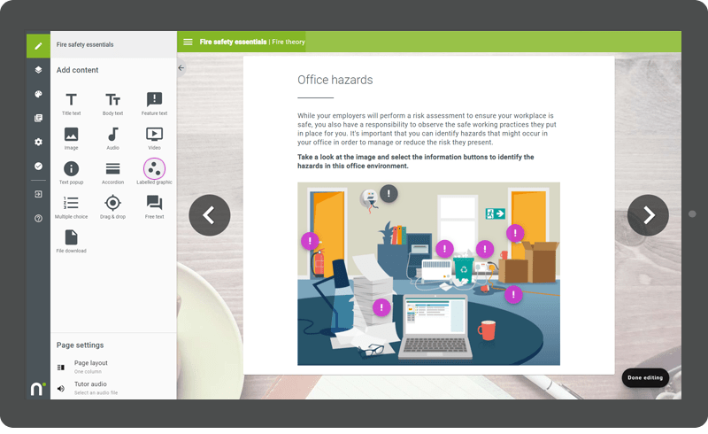
Images can anchor learning so that it’s much easier to apply in the real world of work. Nimble Author has a useful labelled image function that is really helpful in achieving this; for example, in a health and safety course for your team, you could use a photo of the office and label any potential hazards. Research shows that your learners are more likely to apply this knowledge (known as learning transfer). If information is presented in a context that matches the real-life situation where they need to use it, people do much better at recalling it (and if you can’t get them all in the real location, a virtual one is the next best thing!).

By following these simple principles, you can elevate your elearning and make the most of every page.


0 Comments